Choosing paint colors can feel overwhelming with so many options. This guide reveals the hottest 2025 color trends from major paint brands and shows you how to pick shades that match your style and Des Moines home. You’ll learn which colors boost specific moods, how to build balanced palettes, and why professional painting makes all the difference in achieving stunning results.
TLDR: The top 2025 paint trends feature deep jewel tones, warm earth colors, and calming blue-greens. Major brands like Behr, Benjamin Moore, and Sherwin-Williams are showcasing rich, sophisticated palettes that create both energy and tranquility. Professional painting ensures these trending colors look perfect in your Des Moines home while adding lasting value.
Why Your Paint Colors Matter More Than Ever
Walk into a freshly painted room and you feel it immediately. The right colors change everything about how a space looks and feels.
But picking those perfect shades? That’s where many Des Moines homeowners get stuck. You scroll through endless paint chips at the store. You pin hundreds of photos online. Nothing feels quite right.
Here’s the good news. 2025’s color trends make choosing easier. Paint companies have done the research to identify colors that work beautifully together. These aren’t random picks—they’re carefully tested palettes that create harmony in real homes.
This guide walks you through the year’s biggest trends. You’ll see which colors top designers are using. More importantly, you’ll learn how to pick shades that work for your specific home, your lighting, and your personal style.
The Top 2025 Paint Color Trends
What Paint Companies Are Featuring This Year
The three biggest paint brands announce their “Color of the Year” each January. These flagship colors drive trends throughout the industry. Here’s what they picked for 2025:
| Brand | 2025 Color | Description |
|---|---|---|
| Behr | Rumors | Deep ruby red with luxurious warmth |
| Benjamin Moore | Cinnamon Slate | Sophisticated purple-brown blend |
| Sherwin-Williams | Quietude | Serene blue-green for calm spaces |
Sherwin-Williams describes Quietude as a color that brings tranquility and connection to nature indoors. These aren’t just pretty colors—they reflect where home design is heading.
Notice the pattern? These colors go deeper and richer than recent years. Homeowners want spaces that feel substantial and cozy. Light, airy neutrals are stepping aside for colors with real personality.
Pro tip: Use these flagship colors as accents rather than whole-room treatments. They work beautifully on one feature wall or in smaller spaces like powder rooms.
Warm Neutrals and Earth Tones Take Center Stage
Beiges and taupes are back, but they’re warmer and more complex than before. Think less “builder beige” and more “warm latte.”
Top neutral shades for 2025:
- Camel beige with golden undertones
- Rich taupe with gray-brown depth
- Warm cream that’s almost buttery
- Soft greige (gray-beige blend)
These colors create cozy backgrounds that make furniture and art pop. They reflect light well, making rooms feel larger. Best of all, they work with nearly any decorating style.
Earth tones complement these neutrals perfectly. Terra cotta, clay red, and warm browns add depth without overwhelming. They bring the outdoors in—perfect for Iowa homes surrounded by natural beauty.
These shades work especially well in Des Moines homes with traditional architecture. They honor historic character while feeling fresh and current.
Bold Accent Colors Make Strong Statements
While neutrals dominate main spaces, bold accent colors are having their moment. Homeowners want at least one room or wall that shows personality.
Trending bold colors:
- Deep Ruby Red: Creates drama in dining rooms or libraries
- Emerald Green: Adds richness to bedrooms or studies
- Sapphire Blue: Makes bathrooms feel like spas
- Burnt Orange: Energizes kitchens and breakfast nooks
The key is using these strong colors strategically. Paint one accent wall. Use them in smaller rooms where they create impact without overwhelming. Or keep walls neutral and bring in bold colors through furniture and accessories.
Important: Test bold colors in your space before committing. What looks perfect in a showroom might feel too intense in your home’s lighting.
Complex Blues and Greens Dominate Bedrooms
Simple sky blue is out. Complex, moody blues and greens are in. These colors have gray or other neutral undertones that make them sophisticated and restful.
Popular blue-green shades:
- Dusty blue with purple hints
- Sage green with gray undertones
- Teal that leans more blue than green
- Deep forest green for cozy retreats
Research on color psychology shows that blue-green hues reduce stress and improve sleep quality. That makes them perfect for bedrooms and bathrooms where you unwind.
These colors pair beautifully with natural wood tones. They complement both modern and traditional furniture. And they create serene spaces that feel like a breath of fresh air.
How to Choose Colors for Your Des Moines Home
Consider Iowa’s Natural Light
Des Moines sits at 41 degrees north latitude. That affects how sunlight enters your home throughout the year. Understanding this helps you pick colors that look great in your specific lighting.
North-facing rooms get cool, indirect light all day. They need warm colors to feel inviting. Skip cool grays and blues—they’ll look flat and cold. Instead choose warm neutrals, creamy whites, or soft yellows.
South-facing rooms get abundant warm light. They can handle cooler colors without feeling chilly. Try those trendy blue-greens or cool grays. They’ll balance the warm sunlight beautifully.
East-facing rooms get morning sun that shifts to shade by afternoon. Use colors that work in both conditions. Mid-tone neutrals work best here.
West-facing rooms stay dim in morning but get intense afternoon sun. This strong light can make colors look washed out. Choose slightly deeper shades than you think you need.
Pro tip: Paint large sample squares on different walls. Watch them throughout the day to see how light changes their appearance.
Match Your Home’s Architectural Style
Des Moines has diverse home styles—from Victorian mansions to modern ranch houses. Your paint colors should complement your home’s architecture.
For traditional homes (pre-1950):
- Respect original woodwork and details
- Use historically appropriate colors
- Consider two-tone schemes with darker trim
- Add one modern accent color to keep it current
For mid-century homes (1950-1970):
- Embrace retro color combinations
- Try burnt orange, olive green, or mustard yellow
- Keep it clean and uncluttered
- Use bold color blocks for drama
For contemporary homes (1990+):
- Stick with sophisticated neutrals
- Add pops of trendy accent colors
- Keep it minimal and cohesive
- Use color to define different zones
Think About Room Function and Size
Different rooms serve different purposes. Your color choices should support each room’s function.
Living rooms need colors that work morning through evening. They host gatherings but also serve as quiet retreats. Warm neutrals with accent colors work best. They create a versatile backdrop for different activities.
Kitchens benefit from colors that stimulate appetite and conversation. Warm whites, soft yellows, and terra cotta tones all work well. These colors also make food look more appealing—important when you’re cooking and entertaining.
Bedrooms should promote rest and relaxation. Cool blues, soft greens, and muted neutrals help you unwind. Save energizing colors for workout spaces or hobby rooms.
Bathrooms can handle bold colors since they’re smaller spaces. Deep blues create a spa-like feel. Warm neutrals make small bathrooms feel larger.
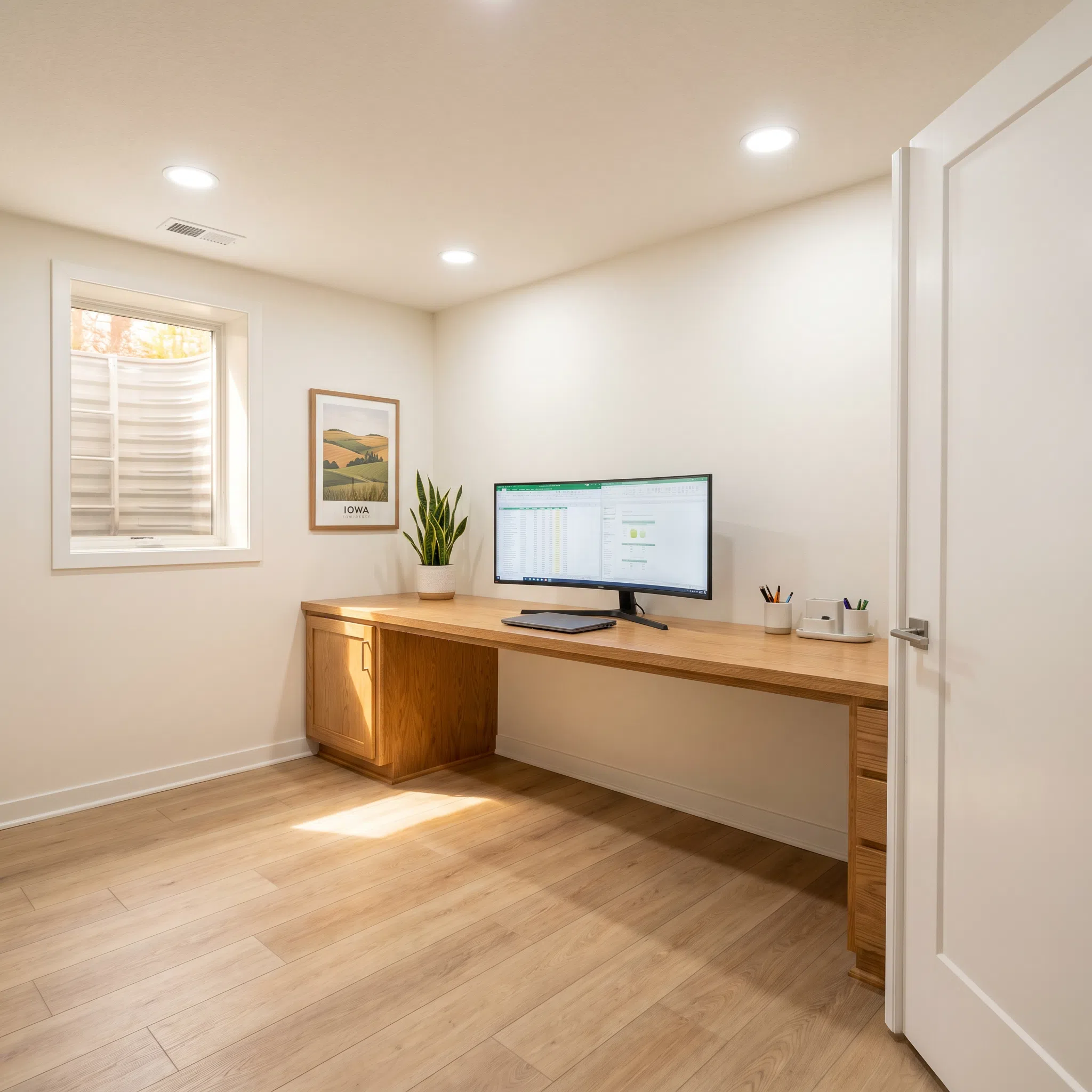
Home offices need colors that boost focus without causing fatigue. Sage green, soft blue, and warm gray all help concentration. Avoid bright colors that distract.
Room size matters too. Dark colors make small rooms feel cozy but can overwhelm them. Light colors help small spaces feel larger. Large rooms handle dark colors better—they create intimacy in expansive spaces.
Coordinate with Natural Materials
Des Moines homes often feature beautiful natural materials—hardwood floors, stone fireplaces, wood trim. Your paint colors should enhance these elements.
With oak or pine floors:
- Use warm paint colors that complement golden wood tones
- Avoid cool grays that clash with warm wood
- Try cream, beige, or warm white
With dark walnut or cherry:
- Light paint colors prevent rooms from feeling dark
- Cream, soft gray, or pale blue work well
- Dark walls only work in very large, bright rooms
With stone or brick:
- Pick up accent colors from the stone’s natural variations
- Use neutrals to let stone be the star
- Avoid fighting for attention with competing bold colors
For ideas on selecting materials that work together beautifully, check out our guide on home remodeling options.
The Psychology of Color in Your Home
How Colors Affect Your Mood
Color isn’t just about looks. It actually changes how you feel. Scientific research confirms that different colors trigger different emotional and physical responses.
Blue lowers blood pressure and heart rate. It promotes calm and helps concentration. That’s why it works so well in bedrooms and offices.
Green represents nature and growth. It’s restorative and balanced. Green helps you feel grounded and refreshed—perfect for spaces where you recharge.
Yellow stimulates mental activity and generates cheerfulness. It’s energizing without being aggressive. Use it in kitchens, breakfast nooks, or craft rooms.
Red increases energy and stimulates appetite. It’s powerful but can be overwhelming. Use it sparingly in dining rooms or as small accents.
Orange combines red’s energy with yellow’s happiness. It’s social and welcoming. Try it in gathering spaces or playrooms.
Purple suggests luxury and creativity. Lighter purples (lavender) are calming. Deeper purples add drama. Use in bedrooms or creative spaces.
Neutrals (beige, gray, taupe) provide rest for the eyes. They reduce visual stress and create peaceful backgrounds. Perfect for main living areas.
Creating the Right Mood for Each Space
Think about how you want to feel in each room. Then choose colors that support those feelings.
| Room Purpose | Desired Mood | Best Colors |
|---|---|---|
| Master bedroom | Restful, romantic | Soft blue, sage, lavender, warm gray |
| Kids’ bedroom | Playful, calm | Pale yellow, mint green, light purple |
| Home office | Focused, energized | Sage green, soft blue, warm gray |
| Kitchen | Social, appetizing | Warm white, soft yellow, terra cotta |
| Living room | Welcoming, versatile | Warm beige, greige, soft gray |
| Bathroom | Clean, spa-like | Crisp white, soft blue, pale green |
| Dining room | Intimate, sophisticated | Deep blue, warm taupe, sage green |
Pro tip: Paint one wall in a bold accent color to add personality without overwhelming the space. This works great in dining rooms, bedrooms, and home offices.
Building Your Perfect Color Palette
The 60-30-10 Rule for Balanced Color
Professional designers use the 60-30-10 rule to create harmonious color schemes. It’s simple but incredibly effective.
60% Dominant Color: This covers your walls and large furniture pieces. Usually a neutral or soft color that creates your overall atmosphere.
30% Secondary Color: This appears in upholstery, curtains, and larger accessories. It complements your dominant color while adding interest.
10% Accent Color: This pops in throw pillows, artwork, and small décor items. It’s your chance to use bold, trendy colors.
Example scheme for a living room:
- 60%: Warm beige walls and sofa
- 30%: Sage green curtains and armchairs
- 10%: Burnt orange throw pillows and artwork
This formula works because it creates visual hierarchy. Your eye knows where to rest (60%), where to explore (30%), and what to notice (10%).
How to Test Colors Before Committing
Never choose paint based on a tiny chip. Colors look completely different on walls than they do on 2-inch squares.
Follow these testing steps:
- Buy sample pots of your top 2-3 choices for each room
- Paint large squares (at least 2 feet by 2 feet) on different walls
- Observe at different times throughout the day and evening
- Look in different lighting conditions (natural daylight, overhead lights, lamps)
- Live with samples for at least three days before deciding
- View with your furniture and décor in place
Natural light changes throughout the day. Morning light has a cool blue cast. Afternoon light turns warm and golden. Evening light from artificial sources changes colors again. A color that looks perfect at noon might feel all wrong at 8 PM.
Important: Paint samples directly on your walls, not on poster board. Poster board doesn’t show how the color interacts with your wall texture and existing colors.
Using Accent Walls Effectively
Accent walls add drama without the commitment of painting an entire room. But they need thoughtful placement to work.
Best walls for accents:
- Behind your bed (creates a headboard effect)
- The wall your fireplace sits on (draws attention to the focal point)
- A wall with interesting architecture (built-ins, alcoves)
- The wall you first see when entering (creates immediate impact)
Avoid making these accent wall mistakes:
- Choosing the wall with the most windows (it won’t be seen)
- Picking a random wall with no architectural interest
- Using a color that’s too bold for the room size
- Forgetting to paint the wall’s trim in a coordinating color
For a kitchen remodeling project, consider painting just your island a bold color while keeping other cabinets neutral.
Why Professional Painting Matters
The Difference Quality Prep Makes
Professional painters spend more time prepping than painting. That’s what separates a good paint job from a great one.
Proper prep includes:
- Filling nail holes and small cracks
- Sanding rough patches smooth
- Cleaning walls to remove dust and grease
- Priming stained or patched areas
- Taping edges with precision
- Protecting floors and furniture thoroughly
Skipping prep steps means your paint won’t adhere properly. It’ll peel, crack, or show imperfections. You’ll need to repaint sooner, costing more in the long run.
Professional painters also know how to handle problem areas. They understand which primers work for different situations. They know when to use shellac-based primers to block stains. They recognize when texture work is needed before painting.
Getting Consistent, Lasting Results
DIY painting often shows inconsistent coverage—especially with bold colors. Professionals achieve uniform results through proper technique.
What professionals do differently:
- Mix all paint cans together (called “boxing”) for consistent color
- Apply proper number of coats (usually two minimum)
- Use quality brushes and rollers that don’t leave marks
- Maintain wet edges to avoid lap marks
- Know how to cut in perfectly straight lines
- Understand optimal temperature and humidity for painting
Professional-grade paints also last longer than economy options. They contain more pigment and better binders. This means better coverage with fewer coats and colors that stay vibrant longer.
When you invest in trending colors, you want them to look perfect. Professional application ensures your vision becomes reality.
Real Des Moines Color Transformation Projects
West Des Moines Ranch Update
A 1960s ranch home needed a serious refresh. The homeowners loved their West Des Moines neighborhood but felt stuck with dated beige throughout.
The solution: We painted the main living area in a warm greige (gray-beige blend) that honored the home’s mid-century roots while feeling current. The dining room got a dramatic deep teal accent wall. Trim stayed crisp white to modernize the look.
The results transformed the space. The warm greige opened up the living room and made the original hardwood floors glow. That teal accent wall became the perfect backdrop for modern artwork and gave the whole home a sophisticated vibe.
Total project cost: $3,200 for 2,000 square feet. The homeowners now love coming home to colors that reflect their style.
Historic Highland Park Kitchen Refresh
This 1920s bungalow had tons of charm but a tired kitchen. The homeowners wanted updated colors that respected the home’s character.
The approach: We kept the original wood cabinets but painted walls in a soft sage green. Upper walls above the wainscoting got a creamy off-white. The result honored the home’s Craftsman style while feeling fresh.
We also painted the ceiling in the same creamy white to brighten the space. The green provided just enough color to be interesting without overwhelming the small room.
This project took three days and cost $1,800. The homeowners gained a kitchen that feels both historic and current—perfect for their remodeled home.
Ankeny New Build Color Consultation
New construction offers a blank slate—but that can feel overwhelming. These homeowners needed help choosing colors for their entire home.
The strategy: We developed a cohesive palette that flowed from room to room. Main living areas got a warm beige (our 60%). Bedrooms used variations of soft blue and sage green (30% and accent colors). Each space felt unique but connected to the whole home.
We also selected a deep navy for the home office and a sophisticated gray-blue for the master bedroom. These gave personality while maintaining the overall calm vibe.
The result? A home that feels thoughtfully designed rather than randomly painted. Every room works independently but contributes to a beautiful whole.
Avoiding Common Color Mistakes
Don’t Choose Colors in the Store
Paint chips look different under fluorescent store lighting than they will in your home. What seems perfect at the store can disappoint once on your walls.
Always test colors at home with proper samples. View them in your actual lighting conditions. This small step saves expensive repainting.
Don’t Follow Trends Blindly
Yes, this guide covers 2025 trends. But trends should inspire, not dictate. Choose colors you genuinely love—ones that work for your lifestyle and home.
If you hate blue, don’t paint your bedroom blue just because it’s trending. If you love yellow, use it even if it’s not the hottest color this year. You live with these colors daily. They should make you happy.
Don’t Forget About Undertones
Every color has undertones—hints of other colors mixed in. Beige might have pink, yellow, or gray undertones. Gray might lean blue, green, or purple.
Undertones matter because they determine how colors work together. They also affect how colors look in different lighting. A beige with pink undertones might look peachy in afternoon light. A gray with blue undertones might feel cold in north-facing rooms.
Pro tip: Hold your paint sample next to the undertones in your flooring and furniture. Do they harmonize or clash?
Don’t Use Too Many Colors
More colors don’t mean more interesting. They usually mean more chaotic. Stick to 3-4 colors throughout your main living areas.
Having one cohesive palette helps your home flow. You can vary the colors from room to room, but they should all work together when viewed from connecting spaces.
Frequently Asked Questions
What’s the most popular interior paint color for 2025?
Warm neutrals lead the trend, especially sophisticated beige and greige tones. These create versatile backgrounds that work with any style. For accent colors, deep jewel tones like emerald and sapphire are trending strong.
How do I choose between warm and cool colors?
Consider your home’s natural light and existing finishes. North-facing rooms need warm colors to feel inviting. South-facing rooms handle cool colors better. Also think about mood—warm colors energize while cool colors calm.
Should I paint all my rooms the same color?
Not necessarily. While one main color can create flow, varying colors by room adds interest and helps define different spaces. Use the same color family but different shades, or switch colors between main living areas and private spaces.
What’s the best white paint for trim?
Pure white works for modern homes, but most traditional homes look better with slightly warm whites. Benjamin Moore’s Simply White and Sherwin-Williams’ Alabaster are popular choices that work with many wall colors.
How many coats of paint do I really need?
Most colors need two coats for proper coverage and durability. Bold colors like deep red or navy might need three coats, especially over light-colored walls. Never skimp—proper coverage makes colors look their best and last longer.
Can I paint over dark walls with light colors?
Yes, but it requires proper prep. You’ll need a good primer (gray primer works well under most colors). Then apply at least two coats of your new color. Expect to use 2-3 coats for the best results when making dramatic color changes.
What paint finish should I use in each room?
Flat or matte works for low-traffic areas and ceilings. Eggshell suits bedrooms and living rooms. Satin handles higher traffic and light cleaning in hallways. Semi-gloss works for kitchens, bathrooms, and trim. High-gloss is best for doors and cabinets.
How long does interior paint last before needing a refresh?
Quality paint lasts 7-10 years in average conditions. High-traffic areas might need repainting sooner (5-7 years). Bathrooms and kitchens with moisture may need attention after 5-8 years. Regular cleaning helps paint last longer.
Should I hire professionals or DIY my interior painting?
DIY works for simple rooms with good existing paint. Hire professionals for difficult prep work, high ceilings, challenging colors, multiple rooms, or when you want guaranteed results. Professional work costs more upfront but saves time and delivers better results.
What’s the best way to get color consultation help?
Many paint stores offer free color consultation. Professional painters often include consultation in their estimates. Interior designers provide comprehensive color planning. Start with paint store help, then bring in professionals for complex projects or whole-home planning.
Key Takeaways
Here’s what matters most about choosing 2025 interior colors:
Warm neutrals dominate main spaces. Beige, greige, and warm taupes create sophisticated backgrounds that work with any style and make homes feel larger.
Bold accents add personality. Deep jewel tones like ruby, emerald, and sapphire bring drama and interest when used strategically on accent walls or in smaller spaces.
Blue-green shades create calm. Complex blues and greens with gray undertones work beautifully in bedrooms and bathrooms where you want to relax.
Test colors in your actual space. Never choose based on tiny chips. Paint large samples and observe them throughout the day in your home’s specific lighting.
Consider color psychology. Different colors affect mood and energy. Choose colors that support each room’s purpose—calming blues for bedrooms, energizing yellows for kitchens.
Use the 60-30-10 rule. This professional formula creates balanced, harmonious color schemes that look pulled-together and intentional.
Professional painting delivers better results. Proper prep, quality materials, and expert technique make colors look perfect and last longer.
Match colors to your home’s style. Traditional homes need different color approaches than modern homes. Honor your home’s architecture while adding contemporary touches.
Transform Your Home with Professional Color Expertise
The right paint colors change everything about how your home looks and feels. They create the mood you want. They make spaces feel larger or cozier. They boost your home’s value.
But getting there takes more than picking pretty colors. It requires understanding how colors work in your specific space, with your lighting, and with your existing finishes.
That’s where Busy Builders comes in. Since 2020, we’ve helped over 1,000 Central Iowa homeowners transform their spaces with expert painting and remodeling services. We understand Des Moines homes—from historic bungalows to new construction.
Our interior painting services include:
- Complete color consultation and trend guidance
- Professional surface preparation and repair
- Premium paints and materials
- Expert application techniques
- Protection of your floors and furniture
- Thorough cleanup and final inspection
We also coordinate painting with bathroom remodeling and other renovation projects, ensuring everything works together perfectly.
Whether you’re updating one room or repainting your entire home, we bring the expertise to make it beautiful. We’ll help you choose colors that work for your lifestyle, your home’s architecture, and Iowa’s unique lighting conditions.
Ready to see what the right colors can do for your home? We offer free consultations to discuss your vision, answer questions, and provide accurate estimates.
Let’s create the beautiful, colorful spaces you’ll love coming home to every day.
Schedule your free color consultation today.
🌐 Visit busybuildersiowa.com to explore our interior painting services and book your consultation.